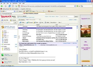
Have anyone tried the New Yahoo! Mail beta? I just got a chance to test it. I was bowled over. It's such a beautiful interface coupled with new features, it's gonna be a runaway hit and a trendsetter. Now Yahoo mail box look almost like my outlook mailbox and it is as much easy to navigate through the thousands of mails. here are a few highlights
1. The interface. So easy. Click on a mail, the contents show up in the lower pane. Want to see in big window? Double click, and ANOTHER tab pop up. The previous list of mails remain there. No back & forward anymore.
2. Contacts ; They made it into a neat list, instead of an ugly small window. Click as many as you want, and CLICK RIGHT BUTTON!!!! you can send mail (forget CC & BCC), Edit or Delete the contact or add.
3. RIGHT Button Menu; Now just like window applications, you could select different options in your web page!!! Yes it's true. For each pane, the menu list is different.
4. Key board short-cuts; What a relief. Use Keyboard shortcuts like, select a message, press 'r' and the reply tab is opened!!! How easier it could get??
5. It's fast!!! No more agonising wait to open up the message. It's all there when you sign in. Click on the list, it is there.!!!
Cons;
It could be a tad heavy on resources. I ran the test on Firefox and at a point CPU usage is 95%. And it's frequent. So having more than one tab while this is open may be a little taxing on the resources.
I can't see nothing else...
A fine product from Yahoo!. This is going to change the way we see web-based e-mails. And a sure shot winner!!!
2 comments:
A new innovation from Yahoo is really appreciated. Mr Shinu, you have beautifully described about the Yahoo beta system thru your blog! My Compliments!. Such technologies are not known to most of the internet users, so we should spread this great news to internet horizon.
Compliments to Yahoo Technical team too.
Regards
Navin Thomas
Mumbai
Shinu, yeah I've been using it but its too 'heavy' on resources. I love the Gmail interface. Its plain and simple! AND it doesnt consume too many resources :)
Post a Comment